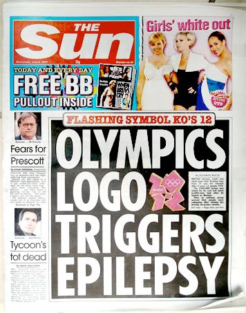
 Well, if the point was to attract attention and stir controversy, then the 2012 London Olympics logo is a success. What looks like a decent logo that was dropped on the floor (quintessential British teeth?) is actually stylized numbers (2012) in hot pink. When rendered as flashy animation, it is said to cause seizures, like those old Pokemon cartoons.
I think it looks like Lisa Simpson giving head.
Look for the link to the mp3 of the BBC radio interview with designers Jessica Helfland and Adrian Shaugnessy on the logo here.
3 comments:
okay, the title really made me laugh! poor brits, spending a fortune and ending up looking stupid.
In the BBC radio interview, Jessica Helfland said something to the effect that the problem with stuffed shirts asking for something "cool" is that they wouldn't recognize it if it hit them in the head.
This is a case of trying too hard to be hip and ending up looking like something from the 80s.
Plus the hype is too much. If you need to hold a press conference to explain how cool it is...
Hey Missingpoints,
Thank you for visiting my blog! =)
Post a Comment